All Projects

Snap Inc.
Revenue Product Design
I was challenged to define a system for motion design that could be used across Snapchat’s web properties - starting with the ads platform. These foundations helped establish the Enterprise Snap Design System which is now being used across the majority of Snapchat’s business websites. By being thoughtful and purpose driven in our design system for motion we are able bring clarity and focus to complex products.
Team Manager - Matt Fichtner
UI Design - Hang Yu
Illustration - Ivan Blanco
Interaction Design - JOE 4TA
Advanced Create Flow
Quick & Easy Create Flow
Core Principal
Concentration
Customers use Snapchat's Web Products to bring their ideas into focus for Snapchatters. We use motion to bring Snapchat’s Web Products into focus for our customers. Our idea of motion is built on a foundation of natural movement, which a user already understands from using their camera. By building out on the idea of camera movement, we are able to create a rich and cohesive library of motion guidelines. Motion should help ease the customer to feel as if they have resolved an interaction. Like how a camera resolves the final composition, our products resolve the final idea. As the customer moves through the UI, the animation should make them feel like their goal is becoming clearer and clearer.
An interaction animation should give the feeling of concentration when entering and a feeling of resolution when exiting. This empowers the user to feel accomplished when interacting with our products.
Final UI Animations
Exploration Animation
Inside the Camera
How to use Motion
Consistent and Transparent
Motion should help users find what they’re looking for and make actions feel as effortless as a camera auto-focusing.
It should:
-
Be consistent across all web platforms.
-
Help users discover how to use our products without having to read anything.
-
Animate quickly, such that it doesn’t leave users waiting.
-
Provide feedback about whether an action is or is not permanent.
Easy
Motion should support our mission of making our products easy to use.
It should:
-
Support users’ ability to learn the basics of our products quickly.
-
Not call unnecessary attention to itself.
Efficient
Motion should be simple, just enough to communicate to users without excessive flourish.
It should:
-
Be used sparingly, only in moments where it makes our products easier to use or understand.
-
Guide a user’s focus to their next action.
-
Be subtle for recurring actions; larger or more complex animations should only be used for moments that happen infrequently.
Easing/Curving Rules
“For every action there is an equal and opposite reaction”- Isaac Newton
Easing should support our mission of making our products easy. Easing allows us to communicate the impact and meaning of our animations, it should:
-
Not make an element feel like it's “falling” off the screen, instead it should feel like it's resolving.
-
Feel as if an element/page is focusing onto the screen. As if it's been there the whole time.
-
Not pop onto/out of the screen.
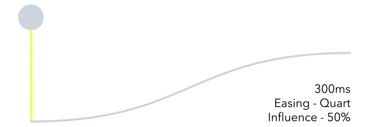
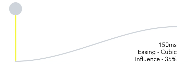
Easing in Snapchats Web Products is broken down into 3 speeds. 150ms for action animations. 300ms for shorter animations. Finally, 500ms is reserved for special/longer animations. Each duration is set to a easing curve which is defined as follows.
> 100ms - Linear
200ms - Cubic
300ms - Quart
500ms - Quint
Long Animations — 500MS
Uses:
Graphs loading
Tasks accomplished

Short Animations — 300MS
Uses:
Pages/Tabs Entering
Cards opening
Action/Exit Animations — 150MS
Uses:
Pages/Tabs Exiting
Cards closing
Button Animations
Effects
Blur
Effects are an important element in making Snap's animation feel unique and concentrated. By using a gaussian blur we create the 'Camera Lens Blur' effect. Paralleling the sensation one gets when focusing through a camera lens, effects should:
-
Not be over used
-
Be used when an element/page is coming towards or away from you. (Bigger/Smaller)
-
Only be used when the opacity is changing. (0%-100%)
-
Blur individual object; not Blur the whole screen/page
Timing/Durations
Timing is an important element to making motion feel natural for objects entering, exiting, or moving within the UI.
-
Objects or pages exiting the screen are quick but not alarming. The user should be able to understand where the UI went while feeling safe that it's not gone forever.
-
Objects or pages entering the view are quick, but celebrated. These animations are typically longer in duration then exits to allow for hierarchical build-up of a screen.
-
Objects translating across a screen should have a duration appropriate to the amount of distance they travel.
-
A small object moving a great relative distance may have slightly longer duration so that the movement isn’t too fast and abrupt.
150ms — Exiting/Action
Use for elements and pages that are exiting the screen or closing. Allows for very quick directional feedback of exiting UI where timing does not impede upon frame-rate to achieve a smooth animation.
300ms — Enter
Use for objects or pages that are entering the screen or opening. Allows an appropriate amount of time to celebrate content as it enters the screen.
≤500ms — Moving
Use for small objects traveling a distance and elements that are translating a story. Icon animations, finished loading states, graph charts, etc.


Exiting + Entering
Entering + Exiting
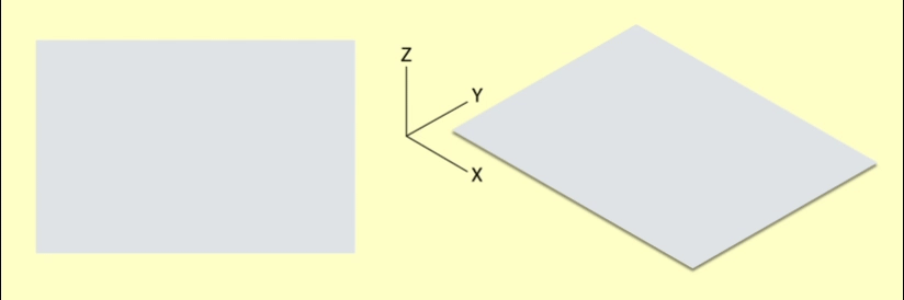
Page * Transition Anatomy
Transitions reflect when users move one level up or down in a page. (We animate as if they are zooming in and out of a camera) When a user goes further into the product, the animation of each page zooms towards the user (The pages get bigger). When a user is exiting a page, or going back in the product, the animation zooms away from them. (The page get smaller)
Keeping this in mind, any interaction the user takes that moves them forward in the product animates elements towards them. Any interaction going backwards animates elements away from them.
The animations should:
-
Always work one after the other (exit+entering)
-
Never be delayed
-
Be consistent through all pages and tables
-
Only when the user makes a “lateral” move do the pages/tabs animate from left-right